You know you have a styling problem on your blog when you have squint to read it. Currently, as of writing this sentence, my blog is, arguably, pretty painful to read. There’s no CSS so far, so we’re going to solve that today in what is probably going to be one of the harder tasks of our listed goals. Now, I know it’s not that hard to set background-color to something other than transparent, but I want to build with both light and dark in mind. It’s hard to put these things in after the fact, not impossible, but I’m looking to be set up from the beginning.
ℹ️ Cascading Style Sheets? Why do they cascade?
An excellent question. Cascading Style Sheets (CSS) are how the internet makes plain looking html look fabulous. Instead of sticking everything into
styletags in html elements, you link styles to classes and ids so that they can be supplied consistently. These sheets can be thrown into, usually, a static directory for static sites or even dynamic sites, and completely change the look of everything.
It’s important to have an idea of what you want to build ahead of time, I got this idea from Bryce Wray when looking into whether or not to make my own theme for a site. No matter the approaches he recommends, the first thing he brings up is having a reasonably good idea of The Final Design. Do I have a good idea of my The Final Design? No. I have two main drives for my design:
- I want a dark mode(and a light mode), and
- I want to base it on solarized
Have You Seen My Stylesheet?
In order to even start testing better colors, we need to tell our baseof.html template to look at our stylesheet. Let’s assume in my assets/ dir I have a file named style.css:
body {
  background-color: #fdf6e3;
  color: #657b83;
}
I would need to use the hugo asset pipeline command resources.Get to signal to hugo that it needs to compile the asset and put the address in a <head> block:
<!DOCTYPE html>
<html lang="{{ site.Language.Locale }}" dir="{{ or site.Language.Direction `ltr` }}">
<head>
  <link rel="stylesheet" href="{{ resources.Get "style.css" }}"/>
</head>
<body>
  <main>
    {{ block "main" . }}
      If you can see this. Something went wrong.
    {{ end }}
  </main>
</body>
</html>
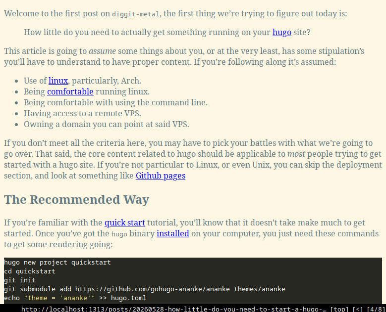
Which gives me something that feels a lot less painful to look at.
Make the Lights Turn On and Off
Now that we have the means to determine what light mode and dark mode look like. It needs to be properly structured to enable us to switch modes. Our style sheet needs to consider both light and dark, and we need some javascript to make that work for the viewer.
ℹ️ Do you really need Javascript?
No! You absolutely don’t, but if you want the user to be able to toggle the themes themselves, then… Yes!
Just What is On and Off?
Here’s where we get into the fun part, picking colors and styles for everything. There are different ways you could go about setting up your theming between light and dark. A lot of this blog’s styling inspiration comes from Fredrik Averpil’s blog, and you could theme it like he does, defining a light and dark class. This seems to be one of the preferred methods, as parts of hugo’s docs also recommends to use a dark class in the root element to define your theme.
When researching this, I found myself wanting a method that would keep my CSS file short. These methods require defining and redefining your theme in several blocks. Even though they might rely on the color-scheme attribute, there didn’t seem to be an easy to say:
“If light then this color, if dark, this color. On one line please.”
Thankfully, it’s 2026 and we have the light-dark() function, which does exactly this. So we can draft up a css file that looks roughly like so:
/* style.css */
:root {
  color-scheme: light dark;
  /* Solarized pallette */

  /* Background Tones */
  --base03: #002b36;
  --base02: #073642;
  --base2: #eee8d5;
  --base3: #fdf6e3;

  /* Content Tones */
  --base01: #586e75;
  --base00: #657b83;
  --base0: #839496;
  --base1: #93a1a1;

  /* Accent Colors */
  --yellow: #b58900;
  --orange: #cb4b16;
  --red: #dc322f;
  --magenta: #d33682;
  --violet: #6c71c4;
  --blue: #268bd2;
  --cyan: #2aa198;
  --green: #859900;
}

body {
  background-color: light-dark(var(--base2), var(--base02));
  color: light-dark(var(--base00), var(--base0));
}

a {
  color: var(--blue);
  text-decoration: none;

  &:visited {
    color: var(--magenta);
  }

  &:hover {
    font-style: oblique;
  }
}
In the :root, we define the base colors and a few color variables and then make definitions directly. The most important part of this piece, besides the light-dark() functions, is the color-scheme variable, which helps determine how the client’s browser reacts to the system preferences for light and dark. No matter how you decide to go about providing options for readers of your blog, color-scheme is essential in ensuring you deliver a consistent experience. I set mine to light dark to tell browsers how I support themeing, which effectively says:
“Tell the browser I support light and dark system themes. If the user has no preference, start with light.”
ℹ️ What if my site doesn’t respect my OS preference?
This might be more a browser problem than an OS problem. Your browser is the window into the internet, and it usually decides whether or not it pays attention to what theme your system sets. In most browsers, such as Firefox or Chromium-based browsers, this should be automatic.
What About the Code Blocks?
By default, hugo supports its code blocks with its own style sheets. By defining these under markup.highlight you can pick different colors to work for you. However, if you want the code blocks to change with your theme, you have to extract these stylesheets out from the engine and set them yourself. For example, if you wanted Solarized, you could extract the light and dark defaults into separate sheets with these commands:
hugo gen chromastyles --style=solarized-light > assets/sol-light.css
hugo gen chromastyles --style=solarized-dark > assets/sol-dark.css
With these, you have a guide for everything that needs to be declared in order to highlight your code blocks. This can go into your main style sheet, or you can keep it separate in another style sheet. I voted for the latter and employed the the lessons I learned from my main style sheet.
/* syntax.css */
/* A few lines just to give you the idea. */

/* Background */
.bg {
  color: light-dark(var(--base01), var(--base1));
  background-color: light-dark(var(--base3), var(--base03));
}

/* PreWrapper */
.chroma {
  color: light-dark(var(--base01), var(--base1));
  background-color: light-dark(var(--base3), var(--base03));
  -webkit-text-size-adjust: none;
}

/* Other */
.chroma .x {
  color: var(--orange);
}

/* LineLink */
.chroma .lnlinks {
  outline: none;
  text-decoration: none;
  color: inherit;
}

/* LineTableTD */
.chroma .lntd {
  vertical-align: top;
  padding: 0;
  margin: 0;
  border: 0;
}

/* The actual style sheet is MUCH longer. */
Then, when you’ve made your style sheet, make sure to tell Hugo that you’d like to use your own stylesheets by modifying the hugo.toml for the theme/blog. Setting noClasses to false will tell hugo not to use the internal themes.
[markup]
  [markup.highlight]
    noClasses = false
Javascript for the Finicky Bits
Bottom line up front (BLUF), I’m not using any front-end frameworks or libraries for my blog. I’m not as anti-javascript as Sean Russell, but I’m also aware that it’s pretty easy to ship bloat to your browser. I want this site to be lightweight, I want people to be able to just open the page up and see what I’m trying to say, no special effects, just good design(hopefully). So we’re keeping the amount of scripting code to a minimum, just for the finicky bits.
ℹ️ What are finicky bits exactly?
Things that you can just assign a css function to, or have html take care of. Finicky bits are what javascript was made for. Like bring custom behavior to a button, or letting you copy code out of a code block.
In our use-case of having a two-toned blog, there are two major bits:
- setting the theme, and
- toggling the theme.
To set the theme, we need something like this:
//init-theme.js
document.documentElement.style.colorScheme = (() => {
  const savedTheme = localStorage.getItem("diggit-metal-theme");
  if (savedTheme) return savedTheme;

  const likesLight =
    window.matchMedia &&
    window.matchMedia("(prefers-color-scheme: light)").matches;

  //Default to dark theme unless the user prefers a light theme.
  const preference = likesLight ? "light" : "dark";
  return preference;
})();
What’s happening here? We are setting the colorscheme value of the root element. This is important because it changes how the entire document responds to color. It’s also doubly important because we want to ensure the theme continues to be set if it’s been toggled, this is why we check to see if there’s an item(property, cookie, etc.) set, in this case diggit-metal-theme. If it’s set then we set colorscheme to whatever that item is.
If there isn’t a set theme, then the script asks watchMedia if the user prefers light or dark, and then sets it. Doesn’t colorscheme do this already? Yes! Not the tracking toggling colorschemes part, but it will definitely respond to the browser if it says, “Render dark” or “Render light’. Since we’re setting colorscheme on every pageload, we have to replicate the behavior. Also, I want these variables to stay in the scope of this script. Were I to make some fun if statements that would eventually determine what the root element’s colorscheme is, then variables like likesLight, savedTheme, and preference would bleed into the rest of the document. That’s the joy of lambdas.
Now, what about the actual button? First the script.
//theme-control.js
document.getElementById("theme-controller")?.addEventListener("click", () => {
  const currentTheme = document.documentElement.style.colorScheme;
  const otherTheme = currentTheme === "dark" ? "light" : "dark";
  document.documentElement.style.colorScheme = otherTheme;
  localStorage.setItem("diggit-metal-theme", otherTheme);
});
Very straightforward, I would say. We set an event listener on a button’s click action. We check what the colorscheme currently is, and then assign whatever is the opposite, and then save that in the browser for next time. The init function will always ensure that there is a value that the button can toggle from.
Tying it All Together
Now that we have our CSS and Javascript, we need to tell the page to use them. Before, I said I didn’t need a header and footer partial, now I do. Well, I need the header at least, but I’ll make the footer anyway.
In the header, we’ll stuff in all of our <html> metadata bits, the <head> element, and the start of our body. Note that we set the theme in the <head> to avoid flashing our readers with dark or light colors before the themes switch. Elements like <head> and <link> aren’t blockng elements, but the script element is, and will halt loading everything else to grab this resource and run it before loading anything else. Lastly, we have our theme toggle at the top of all the pages.
<!-- header.html -->
<!DOCTYPE html>
<html
  lang="{{ site.Language.Locale }}"
  dir="{{ or site.Language.Direction `ltr` }}"
>
  <head>
    {{ with resources.Get "css/style.css" }}
    <link rel="stylesheet" href="{{ .RelPermalink }}" />
    {{ end }} {{ with resources.Get "css/syntax.css" }}
    <link rel="stylesheet" href="{{ .RelPermalink }}" />
    {{ end }} {{ with resources.Get "init-theme.js" }}
    <script src="{{ .RelPermalink }}"></script>
    {{ end }}
  </head>
  <body>
    <button id="theme-controller">Switch</button>
    {{ with resources.Get "theme-control.js" }}
    <script src="{{ .RelPermalink }}"></script>
    {{ end }}
  </body>
</html>
Then our more modular looking baseof.html with partial calls.
<!-- baseof.html -->
{{ partial "header.html" . }}
<main>
  {{ block "main" . }} If you can see this. Something went wrong. {{ end }}
</main>
{{ partial "footer.html" . }}
And finally a placeholder for the footer. A very professional looking set of closing tags.
<!-- footer.html -->
</body>
</html>
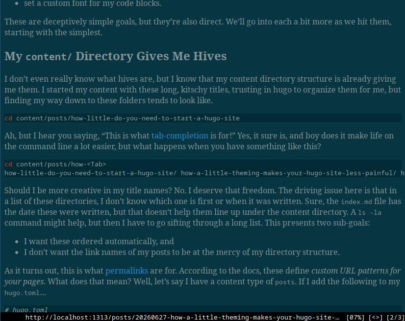
Put it together and what have you got? Bippity, boppity…
Glorious